Overview
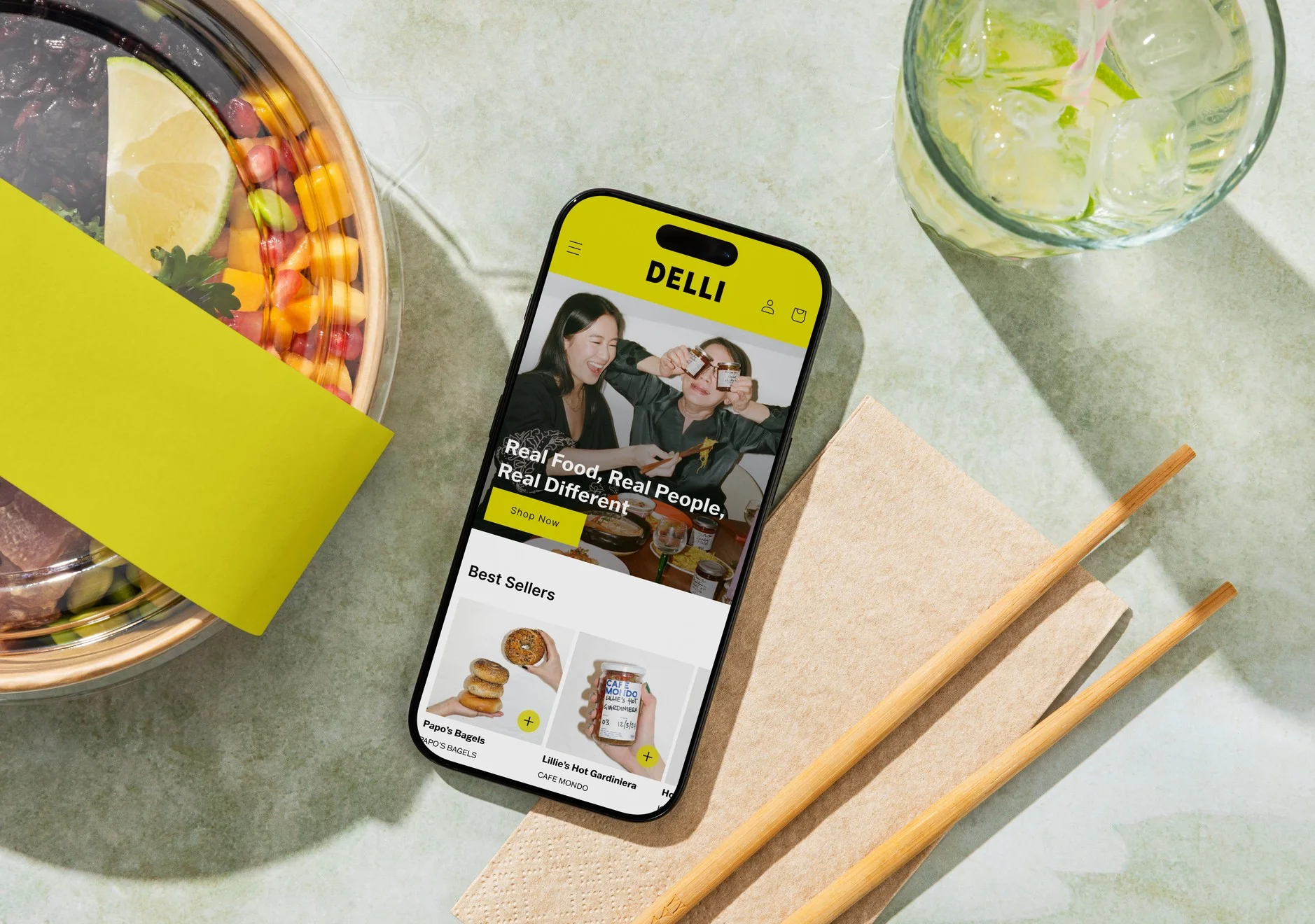
Delli is an e-commerce platform selling food and drink from small, independent makers. I joined shortly after a strategy shift, as the company moved from a marketplace app to a storefront built on Shopify. The site worked but felt like a plain catalogue. Over 12 weeks as sole product designer, I restructured the catalogue, made products easier to discover, and brought the brand to life. Average order value rose 25% and conversion 33%.
The Problem
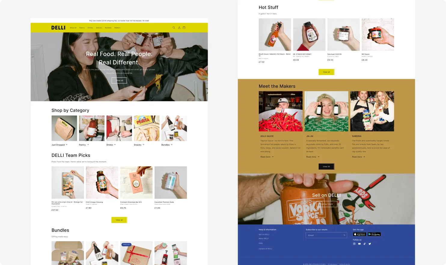
Delli’s customers rarely arrive with a shopping list. They come to browse and find small makers they haven’t met before. The relaunched site felt like a plain catalogue, making products hard to both find and discover.
How might we help customers both find what they’re looking for and discover something new?
This was central to the business. Discovery is how Delli works: limited drops, collaborations, and independent makers waiting to be found.
The Process
User interviews
I interviewed existing and potential customers to understand how they find and discover products on the newly launched site.
Key takeaways:
Often customers come to Delli to discover, not to buy something specific.
When customers do want something specific, it's hard to find.
Customers miss out on limited drops.
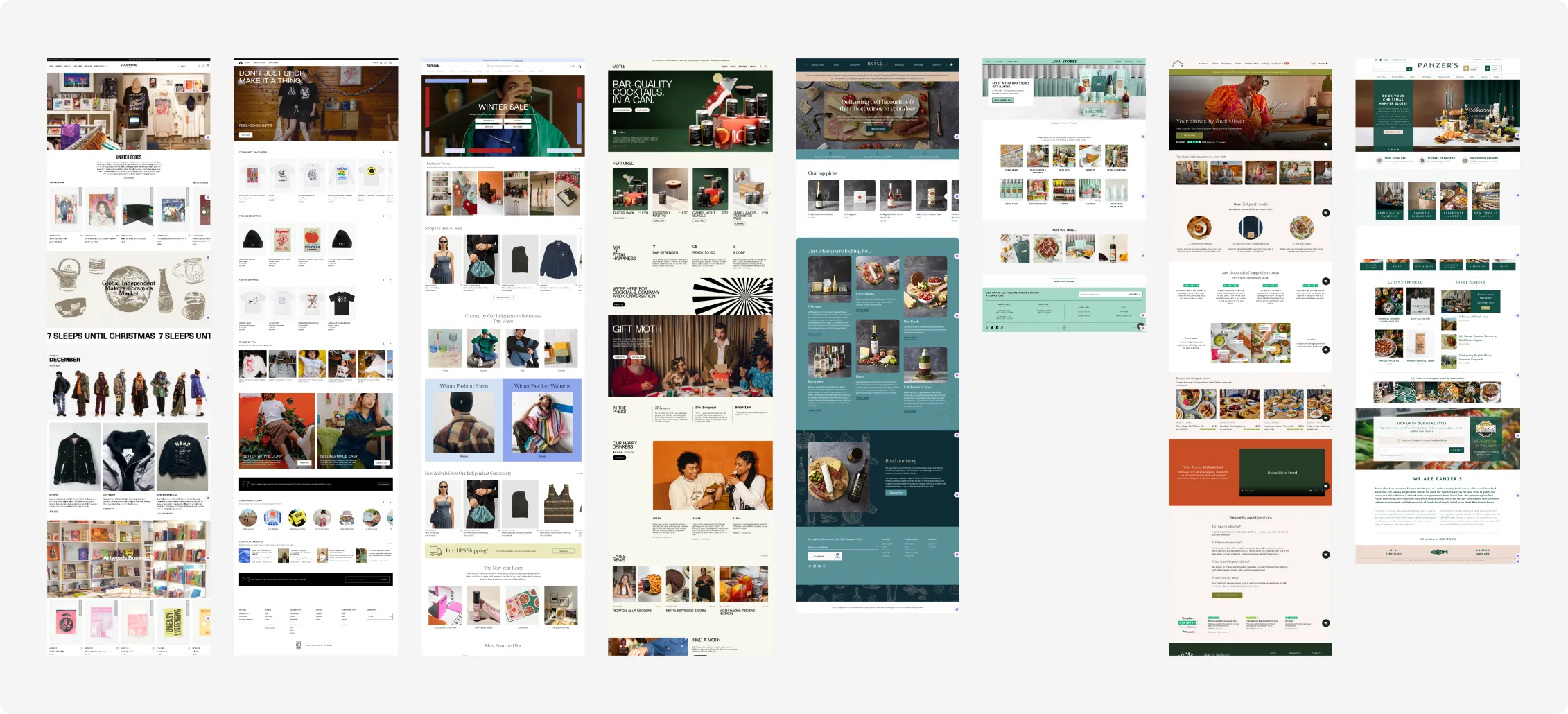
Competitive analysis & website audit
With these findings, I audited the relevant areas of Delli’s site and looked at how other e-commerce platforms approached the same problems. I focused on:
- Categorising products around inspiration
- Presenting and structuring categories
- Grouping products in a way that encourages discovery
- How to make it easier for customers to find what they want
Making Delli an inspirational place
I overhauled the structure and design of the homepage and introduced new features to help people discover and find products.
The relaunched site felt like a plain catalogue. Given that Delli’s whole appeal is its small, independent makers, this felt like a missed opportunity for storytelling.
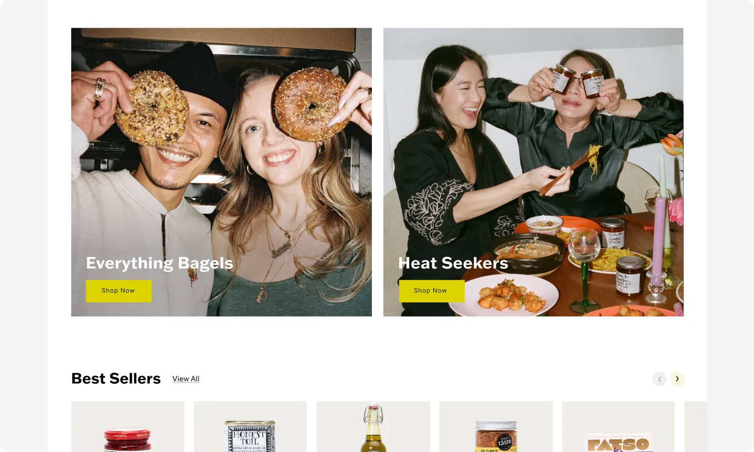
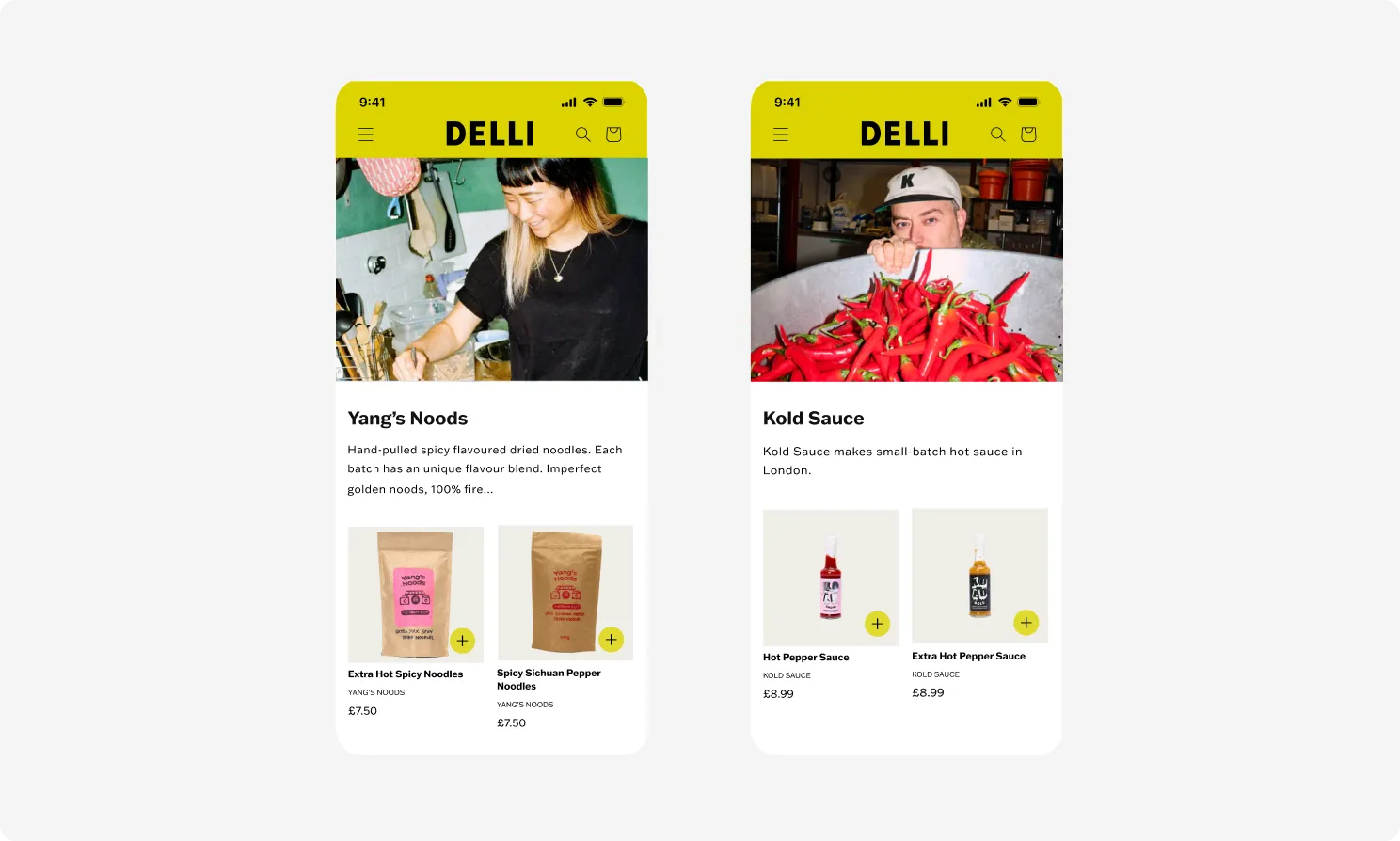
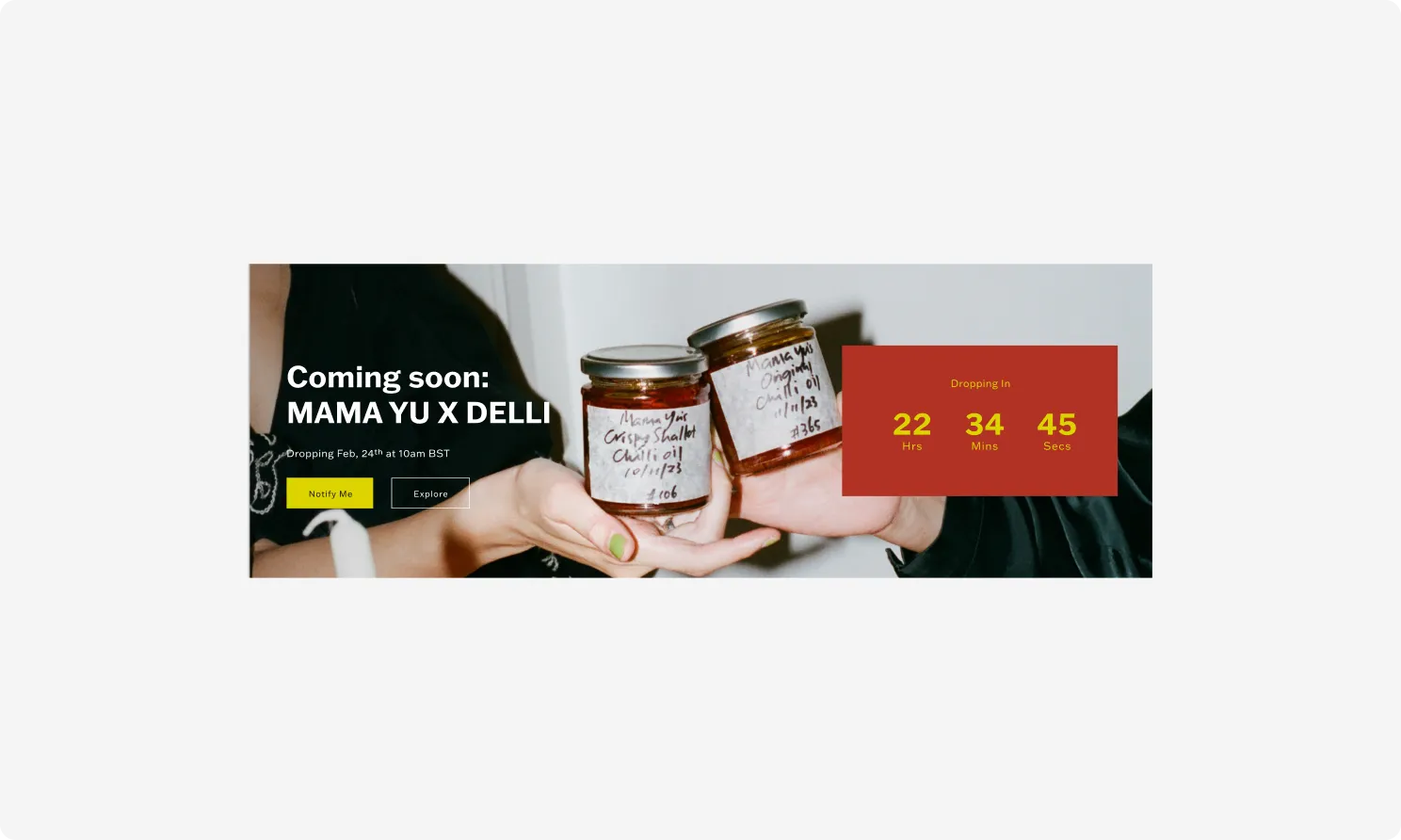
I redesigned the landing page to introduce editorial banners featuring lifestyle imagery, highlighting makers’ stories, subcategories, seasonal collections, and events. These create a visual break from rows of product images and give the page a sense of editorial rhythm that matches the brand.
To take the storytelling further, each maker now has their own landing page, bringing their story and full range of products together in one place. It gives independent makers room to stand out and shoppers a natural way to keep exploring.
Helping people find a specific product
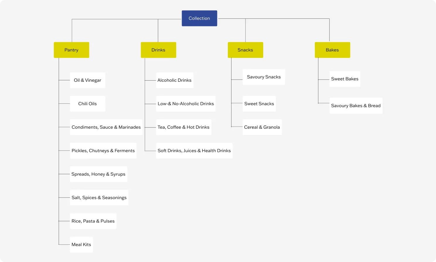
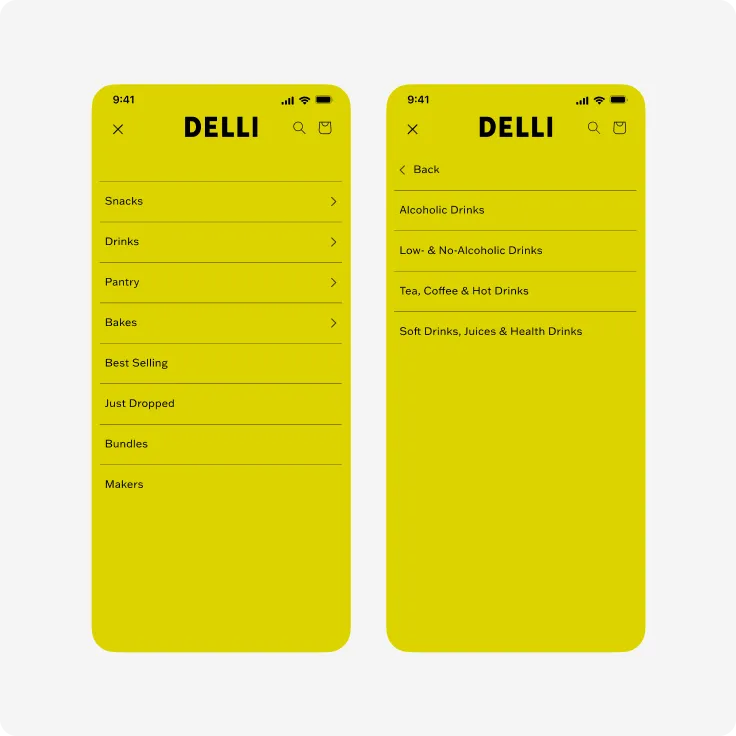
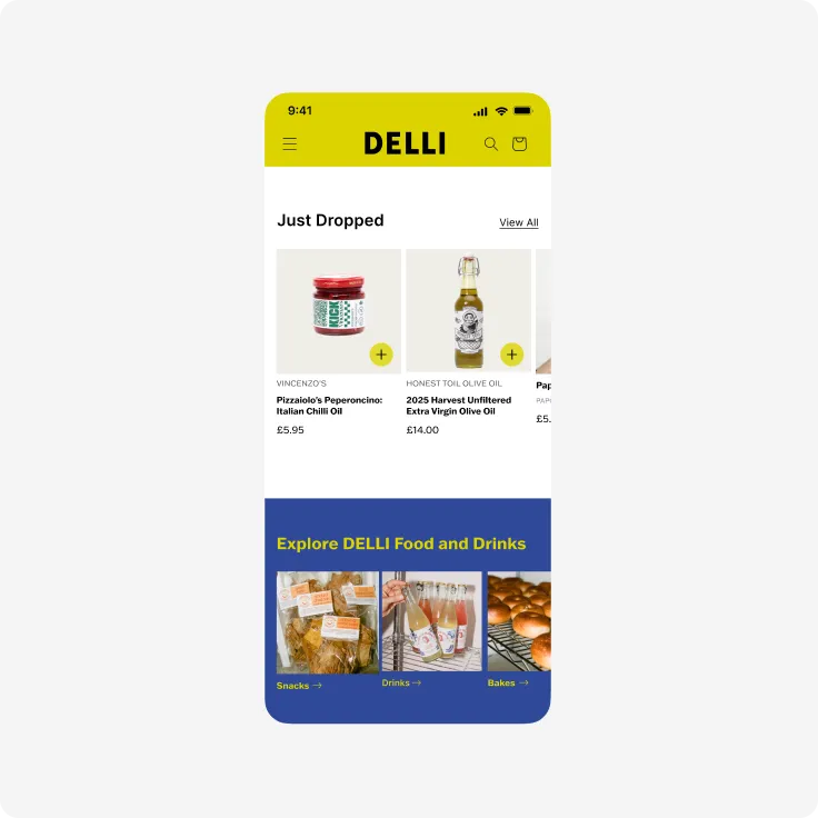
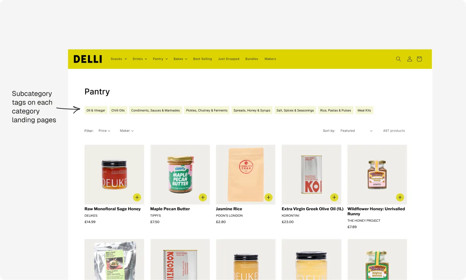
At launch, the site had no subcategories at all. Working with the team I redesigned the catalogue’s information architecture around a clear category and subcategory structure, making it easier to navigate. I applied this structure across the site: navigation-bar menus, filters on category pages and category tiles on the landing page.
Improving product exploration
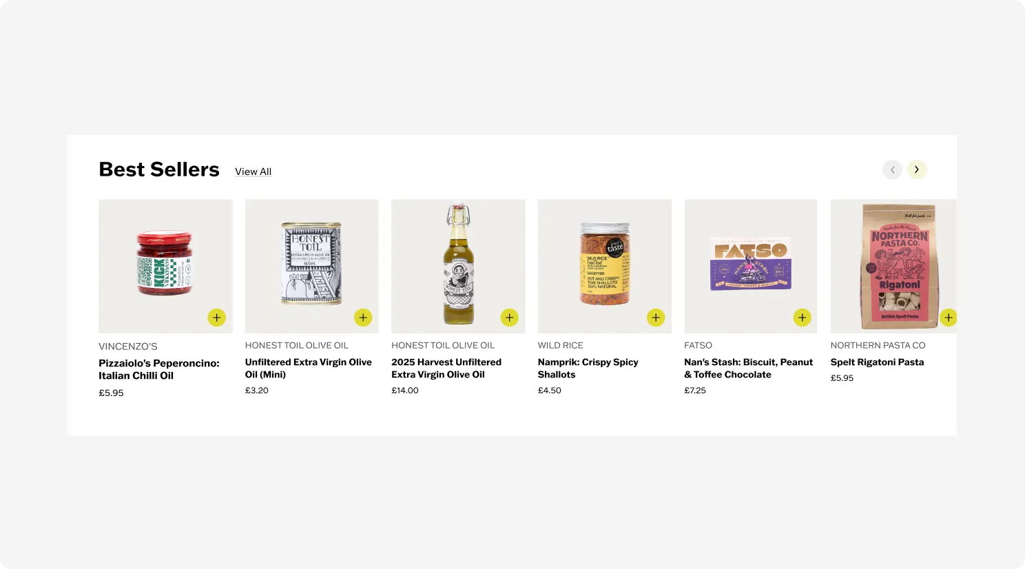
I reworked the product carousels on the landing page. I added more products, the ability to scroll through a collection with arrows and a quick add-to-basket button to reduce friction while browsing.
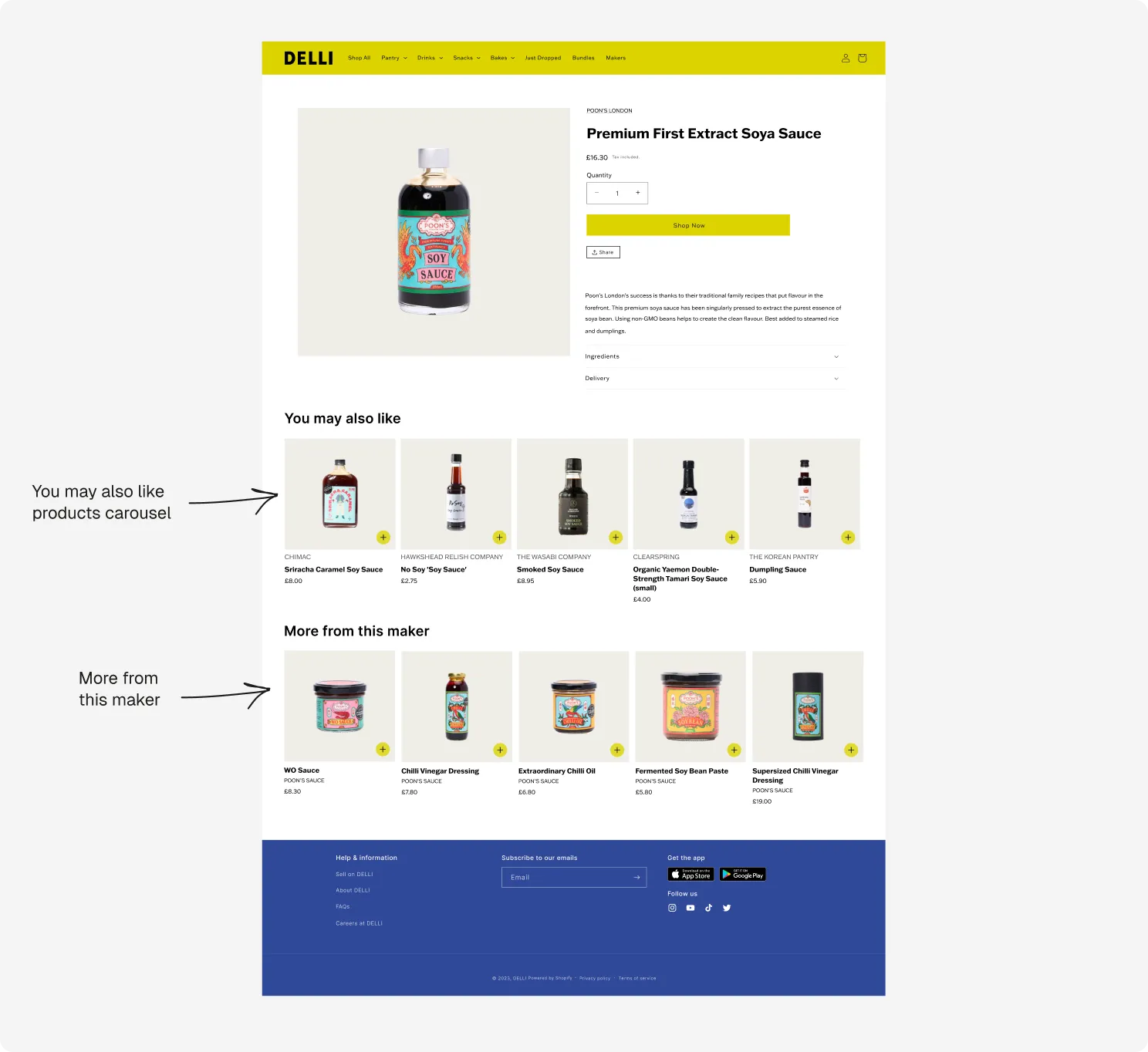
On product pages, I added recommendations for similar products and more from the same maker, so people can keep exploring without returning to the menus and discover more of a maker’s range along the way.
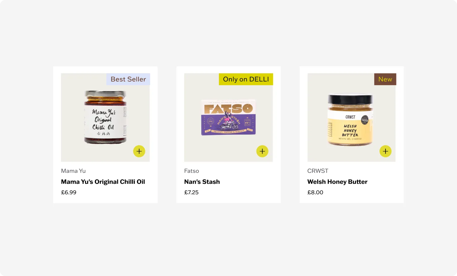
I added product labels to guide browsers. “New” and “Only on Delli” show what’s fresh or exclusive and “Best seller” points to popular choices. These small cues help people decide what to try, especially when they’re browsing without anything specific in mind.
Communicating product launches
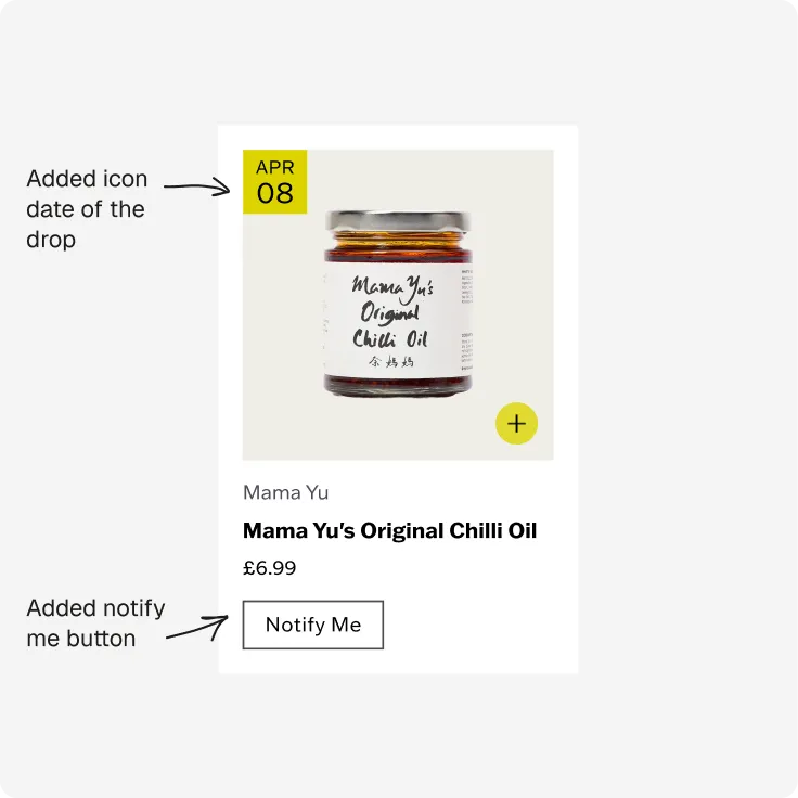
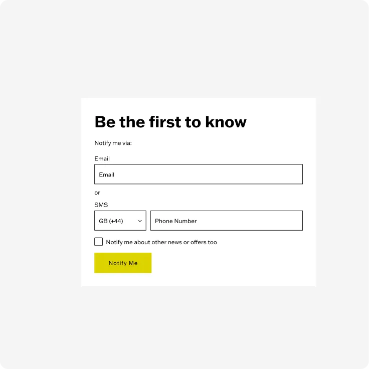
Limited editions with makers are a signature part of Delli, and they tend to sell out fast, leaving customers frustrated at missing out. I introduced a “Notify Me” feature to fix this. Upcoming products show a calendar icon with their launch date and a Notify Me button, so customers can leave their details and be alerted the moment the product goes live. This turns frustration into anticipation, gives the team a built-in audience for each drop, and helps them gauge demand ahead of launch.
Bringing the brand to life
I refined the platform’s visual design, starting from the chosen Shopify theme and bringing it closer to Delli’s edgy, editorial identity through a series of concepts developed with the CEO.
The impact
Over Q1 2024, we managed to increase the average order going from £28.46 to £35.57 (a 25% uplift) and improve the conversion rate by 33%. For context, Delli was raising during this period and went on to close $6M in funding in September 2024.